SelectBoxItの使い方
- 下記ページの 「Fork on Github」 をクリックしGitHubのページ右下の「Douwload ZIP」よりファイル1式をダウンロード。
- ダウンロードしたファイルを任意の場所にコピー。
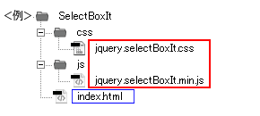
- 動作させるファイル(サンプルではindex.html)にコードを記述。
<パスは上記ファイル構成の場合なので環境にあわせて変更>
・head部分にcssファイルを読み込ませるためのコードを記述。<head> <!--SelectBoxIt用に作成したファイル--> <link rel="stylesheet" href="css/jquery.selectBoxIt.css"> </head>
サンプルのcssコード(サンプルのcssは改変しています)
/*ページ設定部分(style.cssなどで設定していれば削除する)*/ * { margin: 0; padding: 0; } body { background: #fff; font-family: Arial; } #container { width: 300px; margin: 20px auto; } a { color: #333; text-decoration: none; } a:hover { color: #ff0000; text-decoration: underline; } /*ここまでページ設定部分*/ /*ここからjquery.customSelectの設定*/ /* * jquery.selectBoxIt.css 3.8.1 * Author: @gregfranko */ /* Common CSS Properties --------------------- These properties will be applied to any themes that you use */ /* SelectBoxIt container */ .selectboxit-container { position: relative; display: inline-block; vertical-align: top; } /* Styles that apply to all SelectBoxIt elements */ .selectboxit-container * { font: 14px Helvetica, Arial; /* Prevents text selection */ -webkit-touch-callout: none; -webkit-user-select: none; -khtml-user-select: none; -moz-user-select: -moz-none; -ms-user-select: none; -o-user-select: none; user-select: none; outline: none; white-space: nowrap; } /* Button */ .selectboxit-container .selectboxit { width: 220px; /* Width of the dropdown button */ cursor: pointer; margin: 0; padding: 0; border-radius: 6px; overflow: hidden; display: block; position: relative; } /* Height and Vertical Alignment of Text */ .selectboxit-container span, .selectboxit-container .selectboxit-options a { height: 30px; /* Height of the drop down */ line-height: 30px; /* Vertically positions the drop down text */ display: block; } /* Focus pseudo selector */ .selectboxit-container .selectboxit:focus { outline: 0; } /* Disabled Mouse Interaction */ .selectboxit.selectboxit-disabled, .selectboxit-options .selectboxit-disabled { opacity: 0.65; filter: alpha(opacity=65); -webkit-box-shadow: none; -moz-box-shadow: none; box-shadow: none; cursor: default; } /* Button Text */ .selectboxit-text { text-indent: 5px; overflow: hidden; text-overflow: ellipsis; float: left; } .selectboxit .selectboxit-option-icon-container { margin-left: 5px; } /* Options List */ .selectboxit-container .selectboxit-options { -moz-box-sizing: border-box; box-sizing: border-box; min-width: 100%; /* Minimum Width of the dropdown list box options */ *width: 100%; margin: 0; padding: 0; list-style: none; position: absolute; overflow-x: hidden; overflow-y: auto; cursor: pointer; display: none; z-index: 9999999999999; border-radius: 6px; text-align: left; -webkit-box-shadow: none; -moz-box-shadow: none; box-shadow: none; } /* Individual options */ .selectboxit-option .selectboxit-option-anchor { padding: 0 2px; } /* Individual Option Hover Action */ .selectboxit-option .selectboxit-option-anchor:hover { text-decoration: none; } /* Individual Option Optgroup Header */ .selectboxit-option, .selectboxit-optgroup-header { text-indent: 5px; /* Horizontal Positioning of the select box option text */ margin: 0; list-style-type: none; } /* The first Drop Down option */ .selectboxit-option-first { border-top-right-radius: 6px; border-top-left-radius: 6px; } /* The first Drop Down option optgroup */ .selectboxit-optgroup-header + .selectboxit-option-first { border-top-right-radius: 0px; border-top-left-radius: 0px; } /* The last Drop Down option */ .selectboxit-option-last { border-bottom-right-radius: 6px; border-bottom-left-radius: 6px; } /* Drop Down optgroup headers */ .selectboxit-optgroup-header { font-weight: bold; } /* Drop Down optgroup header hover psuedo class */ .selectboxit-optgroup-header:hover { cursor: default; } /* Drop Down down arrow container */ .selectboxit-arrow-container { /* Positions the down arrow */ width: 30px; position: absolute; right: 0; } /* Drop Down down arrow */ .selectboxit .selectboxit-arrow-container .selectboxit-arrow { /* Horizontally centers the down arrow */ margin: 0 auto; position: absolute; top: 50%; right: 0; left: 0; } /* Drop Down down arrow for jQueryUI and jQuery Mobile */ .selectboxit .selectboxit-arrow-container .selectboxit-arrow.ui-icon { top: 30%; } /* Drop Down individual option icon positioning */ .selectboxit-option-icon-container { float: left; } .selectboxit-container .selectboxit-option-icon { margin: 0; padding: 0; vertical-align: middle; } /* Drop Down individual option icon positioning */ .selectboxit-option-icon-url { width: 18px; background-size: 18px 18px; background-repeat: no-repeat; height: 100%; background-position: center; float: left; } .selectboxit-rendering { display: inline-block !important; *display: inline !important; zoom: 1 !important; visibility: visible !important; position: absolute !important; top: -9999px !important; left: -9999px !important; } /* jQueryUI and jQuery Mobile compatability fix - Feel free to remove this style if you are not using jQuery Mobile */ .jqueryui .ui-icon { background-color: inherit; } /* Another jQueryUI and jQuery Mobile compatability fix - Feel free to remove this style if you are not using jQuery Mobile */ .jqueryui .ui-icon-triangle-1-s { background-position: -64px -16px; } /* Default Theme ------------- Note: Feel free to remove all of the CSS underneath this line if you are not using the default theme */ .selectboxit-btn { background-color: #f5f5f5; background-image: -moz-linear-gradient(top, #ffffff, #e6e6e6); background-image: -webkit-gradient(linear, 0 0, 0 100%, from(#ffffff), to(#e6e6e6)); background-image: -webkit-linear-gradient(top, #ffffff, #e6e6e6); background-image: -o-linear-gradient(top, #ffffff, #e6e6e6); background-image: linear-gradient(to bottom, #ffffff, #e6e6e6); background-repeat: repeat-x; border: 1px solid #cccccc; border-color: #e6e6e6 #e6e6e6 #bfbfbf; border-color: rgba(0, 0, 0, 0.1) rgba(0, 0, 0, 0.1) rgba(0, 0, 0, 0.25); border-bottom-color: #b3b3b3; } .selectboxit-btn.selectboxit-enabled:hover, .selectboxit-btn.selectboxit-enabled:focus, .selectboxit-btn.selectboxit-enabled:active { color: #333333; background-color: #e6e6e6; } .selectboxit-btn.selectboxit-enabled:hover, .selectboxit-btn.selectboxit-enabled:focus { color: #333333; text-decoration: none; background-position: 0 -15px; } .selectboxit-default-arrow { width: 0; height: 0; border-top: 4px solid #000000; border-right: 4px solid transparent; border-left: 4px solid transparent; } .selectboxit-list { background-color: #ffffff; border: 1px solid #ccc; border: 1px solid rgba(0, 0, 0, 0.2); -webkit-box-shadow: 0 5px 10px rgba(0, 0, 0, 0.2); -moz-box-shadow: 0 5px 10px rgba(0, 0, 0, 0.2); box-shadow: 0 5px 10px rgba(0, 0, 0, 0.2); } .selectboxit-list .selectboxit-option-anchor { color: #333333; } .selectboxit-list > .selectboxit-focus > .selectboxit-option-anchor { color: #ffffff; background-color: #0081c2; background-image: -moz-linear-gradient(top, #0088cc, #0077b3); background-image: -webkit-gradient(linear, 0 0, 0 100%, from(#0088cc), to(#0077b3)); background-image: -webkit-linear-gradient(top, #0088cc, #0077b3); background-image: -o-linear-gradient(top, #0088cc, #0077b3); background-image: linear-gradient(to bottom, #0088cc, #0077b3); background-repeat: repeat-x; } .selectboxit-list > .selectboxit-disabled > .selectboxit-option-anchor { color: #999999; }・</body>の直前にjsファイルを読み込ませるためのコードを記述。<!--googleのCDN(ネットワーク経由でコンテンツを提供するサービス)よりjqueryをロード--> <script src="https://ajax.googleapis.com/ajax/libs/jquery/1.8.3/jquery.min.js"></script> <script src="https://ajax.googleapis.com/ajax/libs/jqueryui/1.9.2/jquery-ui.min.js"></script> <!--ダウンロードしたファイル--> <script src="js/jquery.selectBoxIt.min.js"></script> <!--javascript追記--> <script> $(function() { $("select").selectBoxIt({ showEffect: "fadeIn", showEffectSpeed: 400, hideEffect: "fadeOut", hideEffectSpeed: 400 }); }); </script>・<body></body>内にコードを記述<select id="test" name="test"> <option value="SelectBoxIt is:">SelectBoxIt is:</option> <option value="a jQuery Plugin">a jQuery Plugin</option> <option value="a Select Box Replacement">a Select Box Replacement</option> <option value="a Stateful UI Widget">a Stateful UI Widget</option> </select>
サンプルのhtmlコード
<!DOCTYPE html> <html lang="ja"> <head> <meta charset="utf-8" /> <link rel="stylesheet" href="css/jquery.selectBoxIt.css"> </head> <body> <div id="container"> <select id="test" name="test"> <option value="SelectBoxIt is:">SelectBoxIt is:</option> <option value="a jQuery Plugin">a jQuery Plugin</option> <option value="a Select Box Replacement">a Select Box Replacement</option> <option value="a Stateful UI Widget">a Stateful UI Widget</option> </select> </div> <a href="https://saetl.net/javascriptsample.html"> <span style="position:fixed; right:10px; top:10px; font-size:1em; color:#000;">Javascriptサンプル集 - Saetl.net</span> </a> <!--googleのCDN(ネットワーク経由でコンテンツを提供するサービス)よりjqueryをロード--> <script src="http://ajax.googleapis.com/ajax/libs/jquery/1.8.3/jquery.min.js"></script> <script src="http://ajax.googleapis.com/ajax/libs/jqueryui/1.9.2/jquery-ui.min.js"></script> <!--ダウンロードしたファイル--> <script src="js/jquery.selectBoxIt.min.js"></script> <!--javascript追記--> <script> $(function() { $("select").selectBoxIt({ showEffect: "fadeIn", showEffectSpeed: 400, hideEffect: "fadeOut", hideEffectSpeed: 400 }); }); </script> </body> </html> - ファイル1式をサーバーにアップロードして設置完了。